So, I like to use Latex for my documents. In school, I was required to type out all my reports and this included everything including any math, chemical structures, electric circuit diagrams, and whatever else. At first my Latex usage was more on the experimental side, then after a few documents I fully jumped in and now I use it almost exclusively.
While I am not an expert, I am not a novice user either. I have seen a variety of shameful and just plain bad usage from other classmates and the odd student that I TA’ed. Over the years, I have managed to pull together a variety of small tweaks so my documents can look a little bit nicer. I really hope that other people can find these tips a bit useful.
Fonts
I really hate the default Latex font, so one of the first things that I do is change the font. Also I am not a huge fan of times new roman. There is a good list of fonts that are available for Latex and for some reason I settled on Palatino.
To switch everything (including math fonts) to Palatino can be done in one line. I use this for pretty much all my documents. Just add the following to the preamble…
\usepackage{mathpazo}To switch everything except the math font to Helvetica, the following two lines need to be added. Again this doesn’t change the math font, so any math will drastically stand out. I think this is ideal for posters and SOP documents.
\renewcommand{\familydefault}{\sfdefault}
\usepackage{helvet}
Page Margins
I don’t understand the default Latex. Apparently, they are ‘book’ margins, but usually I am writing a document not a book, so they don’t appeal to me. The geometry package makes it rather simple to adjust the margins do your document. I usually use either 0.75 or 1 inch for my margins. The following lines need to be added to the document preamble…
\usepackage[letterpaper,margin=0.75in]{geometry}Section Numbering
For very small documents, that is ones that are between 3 to 5 pages in length, and only have a couple of sections, I often turn off section numbering. The section title’s font size, style, and weight are significant enough to indicate that it is a new section. For bigger documents I usually keep the section numbering. Just one line needs to be included in the preamble…
\setcounter{secnumdepth}{-1}Paragraph Spacing and Indenting
The things I usually would write were highly technical in nature. Because of the amount of math and figures involved, the text consisted by many small paragraphs. Two small changes I usually would include are disabling new paragraph indentation and between paragraph spacing…
\setlength{\parindent}{0pt}
\setlength{\parskip}{2.5ex}
NiceFrac
So inline fractions (that is fraction within the text of a paragraph) can be a rather ugly affair. I have seen both of these… $\frac{x}{y}$ and $x/y$… far too often. I believe that the nicefrac package produces nicer and more readable results. The only thing is that the numerator and/or denominator cannot too lengthy.
% Add to the preamble...
\usepackage{nicefrac}

% And its usage...
A math fraction $\nicefrac{x}{y}$ in a sentence.

A regular fraction \nicefrac{a}{b} in a sentence.
Tables
A few quick things to make a table a little more readable. A lot of first year students neglect to do this, but all tables should be centred, that is:
\begin{center}
% Table stuff...
\end{center}
Next the booktabs package adds some functionality that makes tables nicer and easier to read. First only use horizontal lines and use them sparingly, and never use vertical lines on a table. Booktabs provides toprule, bottom rule, and cmidrule to make horizontal lines (and yes, you can provide the thickness). Another, small thing that makes tables more readable is to add a slight amount of extra space between the rows by modifying the arraystretch parameter. All together we have:
% In the preamble...
\usepackage{booktabs}

% add some extra row spacing...
\renewcommand{\arraystretch}{1.2}

% example of a table that uses toprule, cmidrule, and bottomrule
\begin{center}
\begin{tabular}{llcc}
\toprule[1.5pt]
   &   & Location 1 & Location 2  \\
\toprule[1.5pt]
\textbf{Low Power} & Left  & 57.49 & 53.46 \\
                   & Right & 57.64 & 53.48 \\
\cmidrule{2-4}
                   & Average & 57.57 & 53.47 \\
\cmidrule[.5pt]{1-4}
\textbf{High Power} & Left & 58.03 & 53.24  \\
                   & Right & 57.87 & 53.09 \\
\cmidrule{2-4}
                   & Average & 57.95 & 53.17 \\
\bottomrule[1.5pt]
\end{tabular}
\end{center}
Which produces the following:
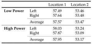
Figure Captions
The default style for figure captions that Latex produces can be easily be improved. One line in the preamble really improves the appearance…
\usepackage[hang,small,bf,margin=1cm]{caption}By using the caption package with a few parameters, one can get to book style looking caption.
No Comments